
Review: Pebble Smartwatch
Wearable tech certainly seems to be the next hot space for hardware. Google Glass, the myriad activity trackers like Fitbit and Nike FuelBand, the list goes on. The Pebble Smartwatch is an interesting entrant into this space not only because of its features, but because it came to life through the largest Kickstarter campaign to date. It started the now-growing trend of consumer electronics launching with funding from the consumers. Pebble is a clever combination of existing technologies in a watch-shaped form factor, giving users immediate access to functions and information on their phone.
Hardware
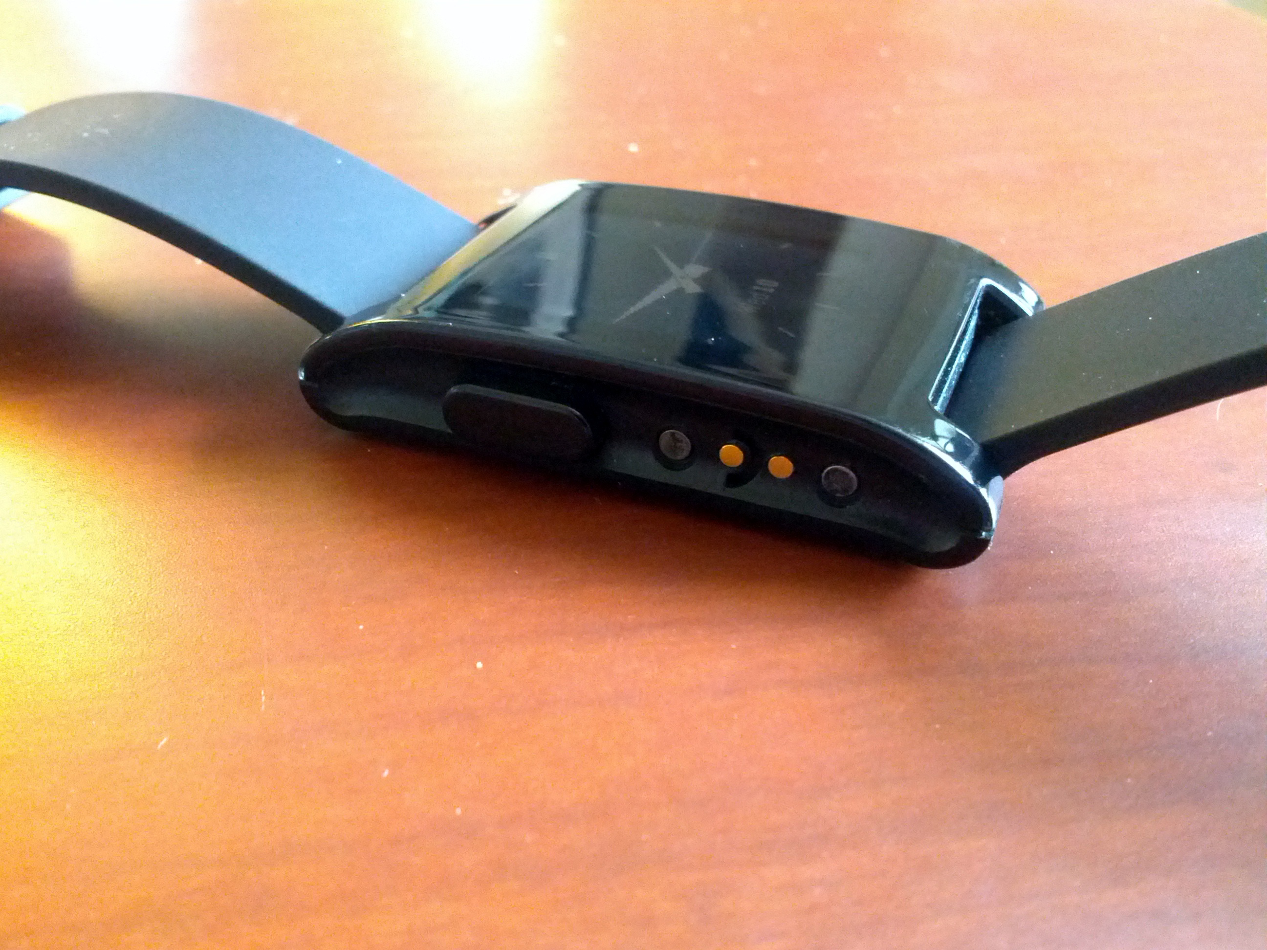
Being a device that you’re likely to wear most or all of the time, Pebble is designed to get out of your way. The body is sealed plastic, with four buttons - one on the left side, and three on the right. The left button is a dedicated Back button which you use to move up through the hierarchical menu. The buttons on the right are soft keys that can be utilized by apps on the watch. Below the left button are the charging pins, which utilize a magnetic charger to maintain watertight integrity. It comes with a black rubber band, which can be swapped out for any other standard 22mm watch band.
The plastic front & screen of the watch is shiny, and definitely looks plastic-y. Even with a more formal watch face selected nobody will mistake it for anything other than a sports watch. If you have polarized sunglasses you may notice what appears to be an oil or chemical refraction when you’re outside. I’m not sure what in the screen is causing this, but it can be disconcerting until you figure out that the watch isn’t broken, it’s just your glasses.
Inside the watch is the circuitry, with a Bluetooth radio, battery and e-paper display. Nothing particular groundbreaking here, though the use of e-paper is a clever solution for a device whose screen is on constantly. There’s also an accelerometer for gesture detection, and a vibrating motor for notifications. The e-paper display has a backlight you can activate depending on your settings.
Overall the hardware feels solid, and while it isn’t ugly it’s not the most beautiful design I’ve seen.
Software
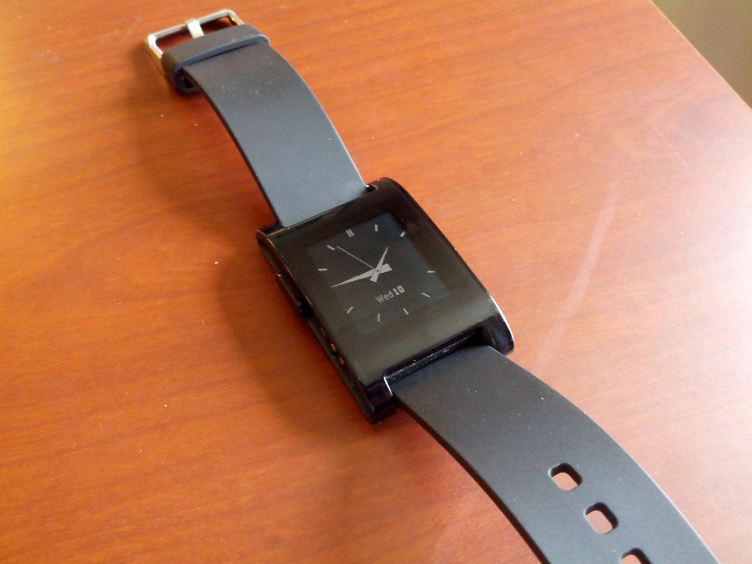
The interface and software for Pebble is simple and spartan. The default screen shows whichever watch face you’ve selected, which you can cycle through using the top and bottom buttons on the right. My personal favorite is the stock analog face, which is complete with a second hand and date display. There are a number of different watch face apps you can install through the Pebble smartphone app.
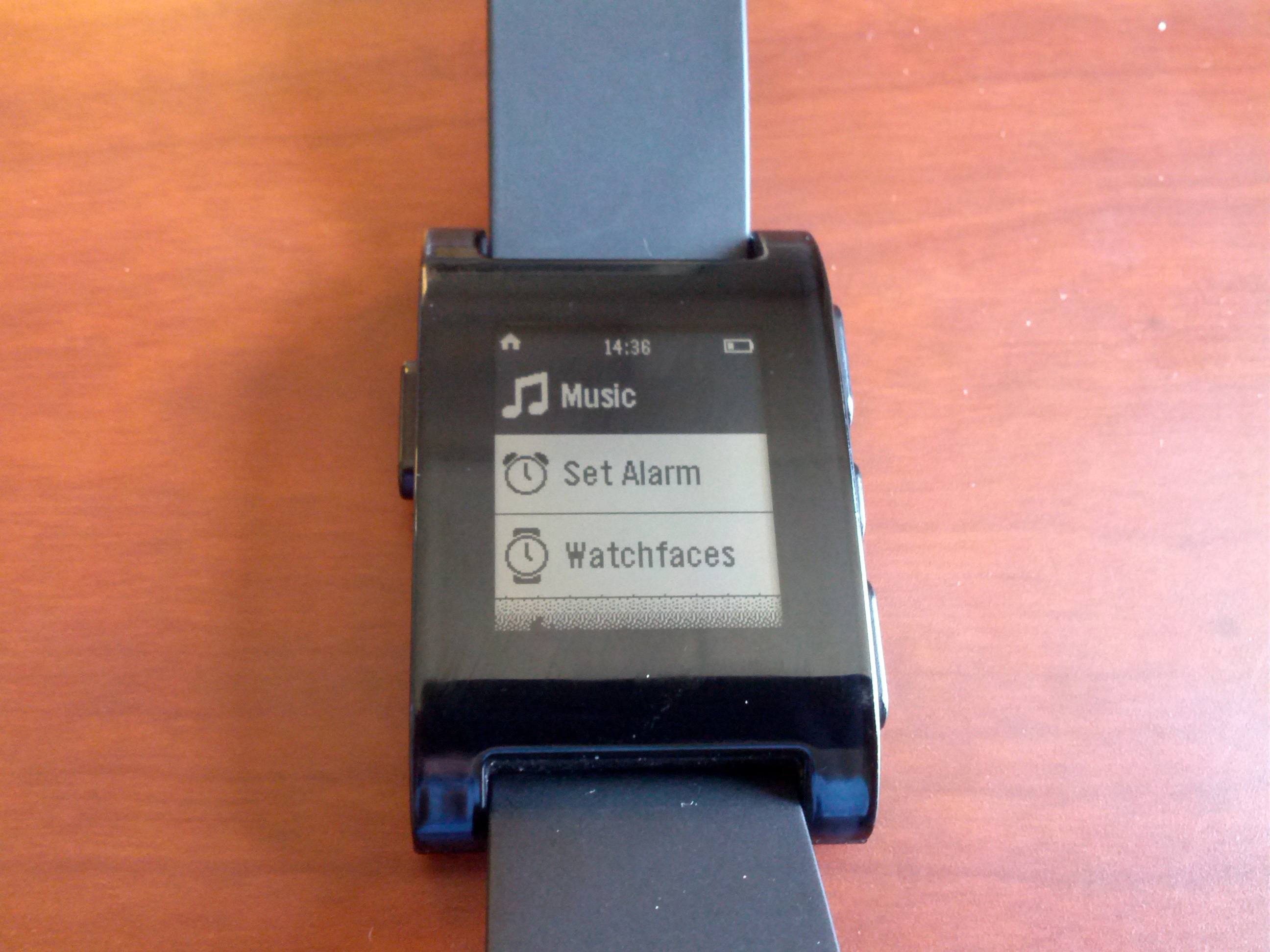
The menu system is pretty basic: a spot to control the music on your phone, a section for setting alarms, an area for managing watch faces, and the setting submenu where you find things like Bluetooth, display & backlight options, power - all the usual stuff. It’s pretty easy to navigate, though you won’t be spending much time in there.
Notifications are one of the major features of Pebble. You can configure all variety of apps to send notifications to your wrist, including phone calls, SMS, and email. For me this is the most useful feature as well, since there are countless occasions when I’ve missed a call or message because I didn’t feel my phone vibrate in my pocket. When the notification vibrates my wrist, there’s no way I’m going to miss it. The flip side is to make sure you’re judicious with which notifications go to your watch or else it can get annoying very quickly.
Another bonus of the Pebble that no other non-connected watch has is always having the right time. It syncs the clock with your phone, which syncs its clock with your carrier, so your watch is always accurate even if you change time zones. That’s always been a major annoyance for me when wearing a watch that I no longer have to worry about.
Connectivity between the watch and your phone can sometimes be tricky. Once you get it connected it works flawlessly, but if you walk away from your phone and the connection is lost, it won’t reconnect automatically when you’re back in range. You have to manually cycle your phone’s Bluetooth to trigger the app to connect again. It’s frustrating, especially if you didn’t realize you went far enough away to disconnect and don’t notice the lost connection for a long time.
Battery Life
Pebble claims the watch can run for 7+ days between charges. My mileage has been closer to 5 days. That’s still pretty good for a device with an always-on screen and a radio transceiver, but if you’re used to months at a time with a traditional watch you may be a little annoyed. If you’re somebody who takes their watch off at night then just plug it in next to your phone and you’ll never have to worry about it. I wear my watch 24/7, so about once a week I end up taking off my watch during the day for an hour or so while it charges.
Unfortunately there is no indicator of remaining battery until you’re within a few hours of it running out, so you can’t really anticipate when it’ll need a charge without counting days. Once or twice I’ve been out all day and my watch has died because I didn’t know before leaving the house that the battery was running low. It’s not a huge problem, but it’s annoying and something that seems easily fixed.
Day to Day Usage
I’ve had my Pebble since late March, and I’ve waited until a few months later to write a review so I could really test it in a wide variety of situations and conditions. If you’re somebody who likes to wear a watch than you’ll have no issue adjusting to wearing it, since it feels like any other watch on your wrist. Being able to choose different watch faces depending on what I’m doing is a neat feature, and as I mentioned before I love never having to set the time.
Within a week I’d grown so accustomed to getting notifications on my wrist that now I can’t imagine going back. It’s supremely convenient not only for knowing when important messages have come in, but for knowing without even looking at my phone that the message that just arrived isn’t something I need to deal with.
Fitness app RunKeeper added support for Pebble in May, which is a huge help. When I go running I keep my phone in an armband, which means it can be awkward to manage the controls, and nearly impossible to check things like my time and pace while I’m moving. All that stuff shows up on Pebble during a workout.
Wrap-Up
For the most part I love my Pebble. Notifications rock, The screen is easy to read, and it’s comfortable to wear. The build quality is solid (I’ve gone swimming with it a few times without issue), though the appearance definitely looks like a watch that costs much less than it does. I wish the battery life was a little longer, or at least have a better indicator for how much juice is left. Connectivity could use a bit of tweaking.
For the first example we’ve seen of a smartwatch, Pebble delivers a great experience. The designers did a great job of limiting its feature set, keeping it simple enough to be enjoyable for use on a wrist. It’s become an integral part of my daily life, which is about all I need to say.

